Brief
I was tasked with branding a sub-brand of an F&B company that imports food and beverages from South Africa. The sub-brand specializes in premium gift sets and operates during the Chinese New Year and Mid-Autumn festivals, targeting an audience willing to invest in premium products. The objective was to create a high-end look and feel.
I was tasked with branding a sub-brand of an F&B company that imports food and beverages from South Africa. The sub-brand specializes in premium gift sets and operates during the Chinese New Year and Mid-Autumn festivals, targeting an audience willing to invest in premium products. The objective was to create a high-end look and feel.
Solution
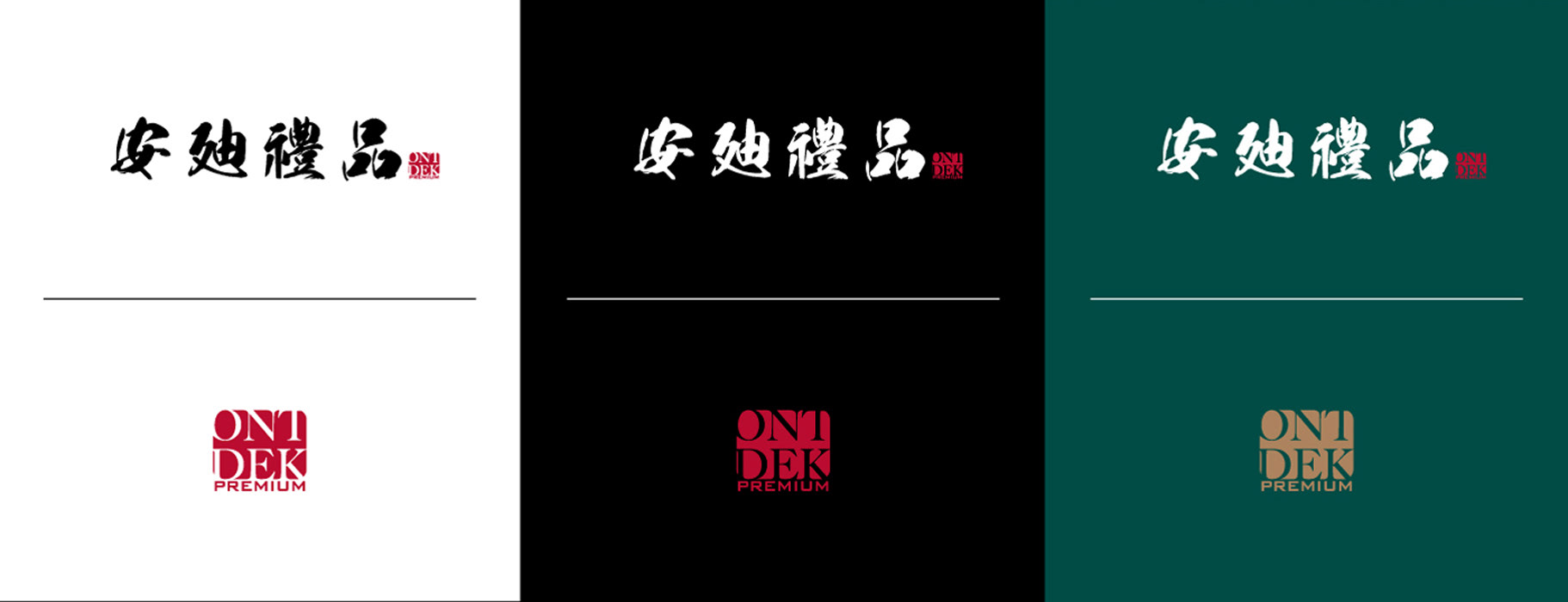
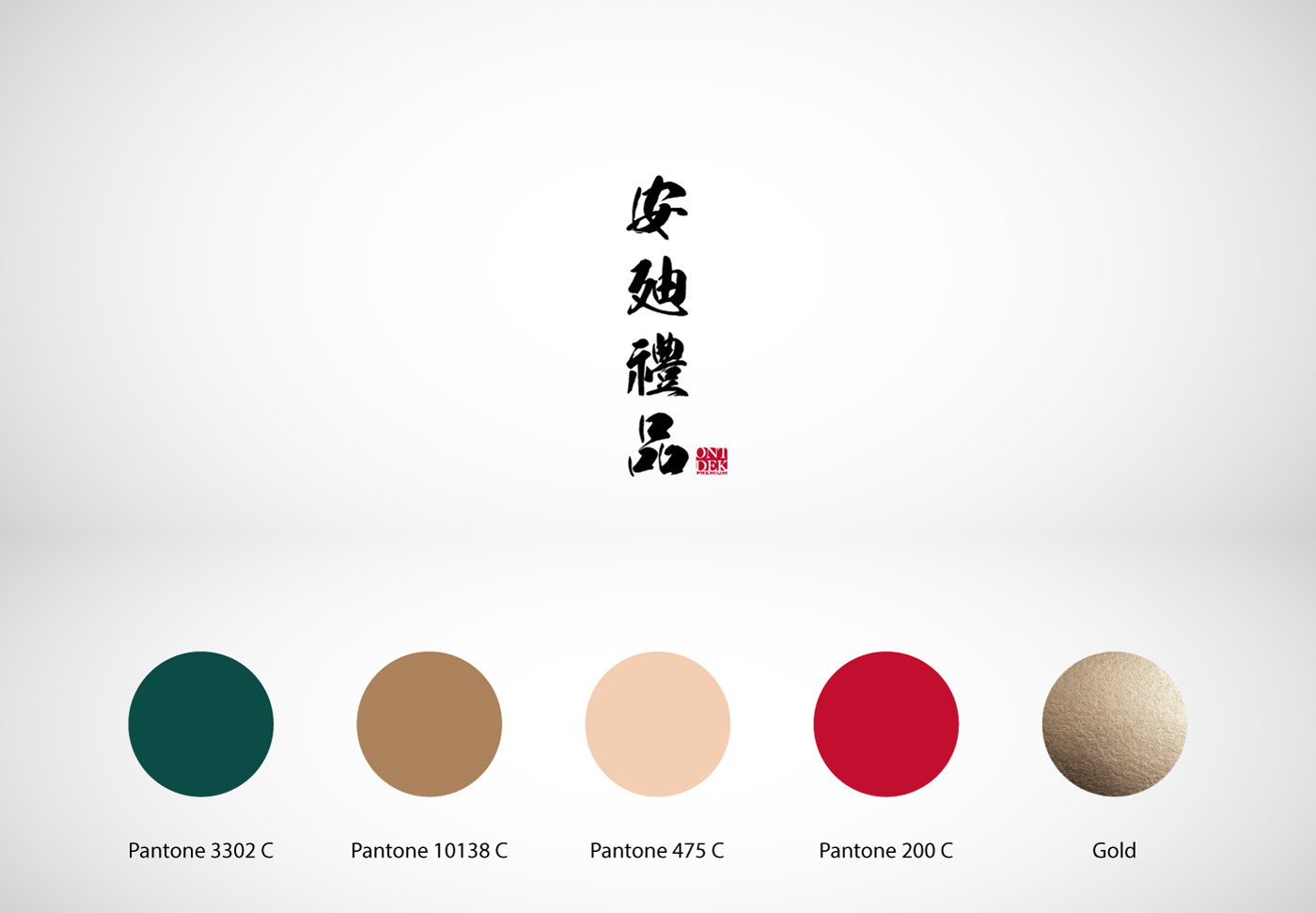
In collaboration with the client, we decided to use the Chinese name as the central element of the logo to resonate with the primarily Chinese audience. The logo combined traditional Chinese calligraphy with an English stamp, blending old and new.
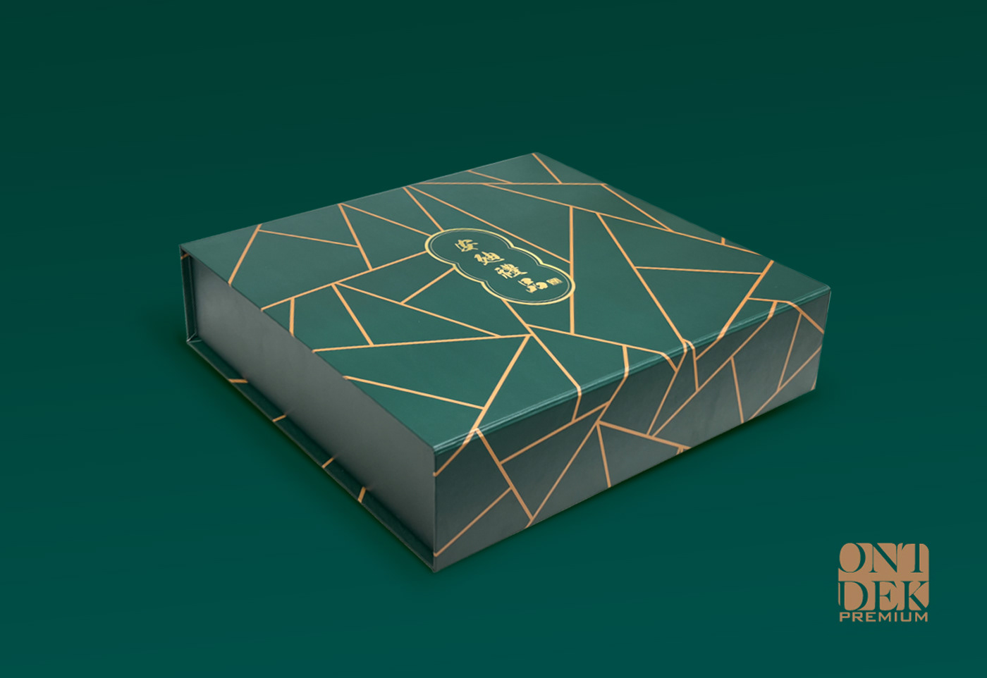
To convey a sense of exploration and premium quality, we selected imagery and utilized a color palette of green and gold throughout the brand.
This approach successfully achieved a luxurious brand identity that appeals to the target audience’s preferences and cultural background.
In collaboration with the client, we decided to use the Chinese name as the central element of the logo to resonate with the primarily Chinese audience. The logo combined traditional Chinese calligraphy with an English stamp, blending old and new.
To convey a sense of exploration and premium quality, we selected imagery and utilized a color palette of green and gold throughout the brand.
This approach successfully achieved a luxurious brand identity that appeals to the target audience’s preferences and cultural background.